Widget Studio
What is Widget Studio?
Build a widget once as a preset, then point a floating widget or a theme block at it by Widget ID. From then on you change only style and content in Studio — every place that uses that Widget ID updates instantly, without touching your theme again. It's under Widget Settings → Widget Studio in the app.
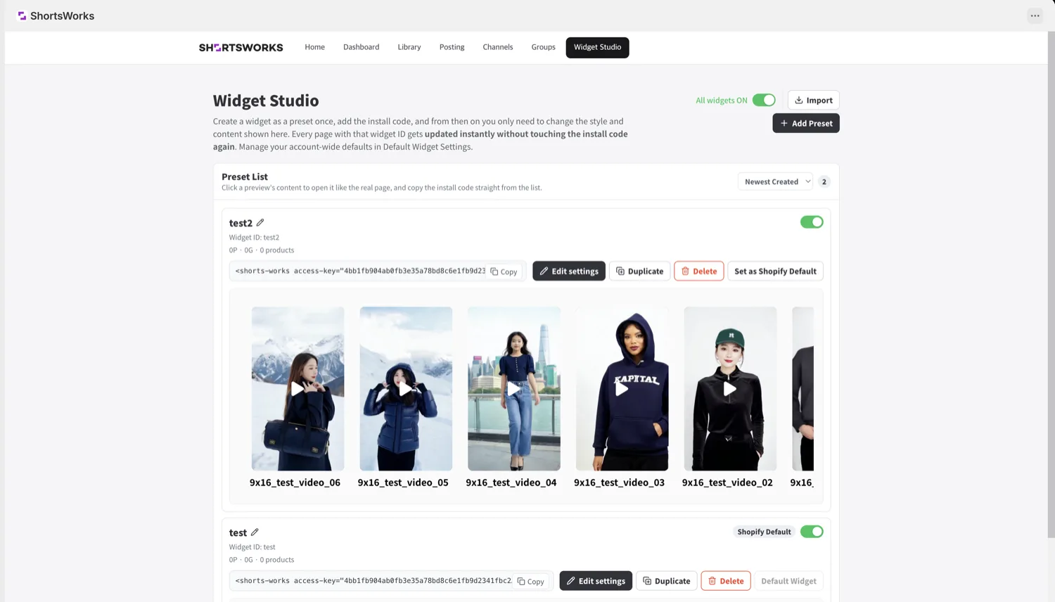
Create a preset
- Open Widget Settings → Widget Studio.
- Click + Add Preset at the top right.
- Give it a name and a Widget ID.
- The Widget ID is what goes into a widget. Renaming the preset keeps the Widget ID, so links don't break.
- Use a descriptive ID — like
main-storyorproduct-feed.
- Use the preview to check the result on desktop and mobile. Changes save automatically.
- On Shopify, point a floating widget or a block at this preset by its Widget ID.
Preset settings
Click Edit settings on a preset. Change values on the left; the preview updates on the right.
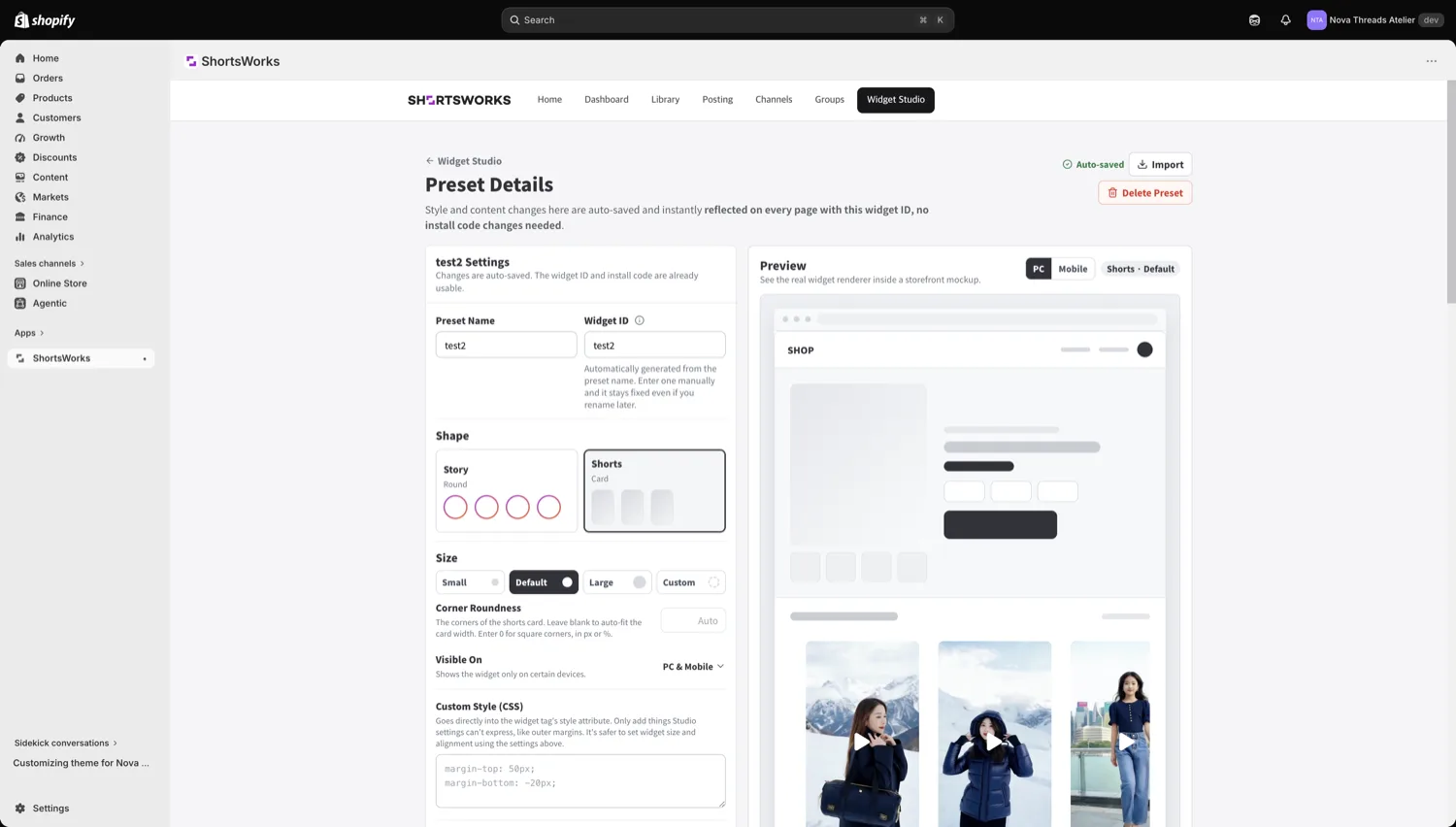
Shape & size
- Shape — Story (circular) or Shorts (cards).
- Size — Small / Basic / Large / Custom.
- Corner radius — ignored for Story shape; empty is circular,
0is square (px or %). - Show on — all devices, or PC/mobile only.
- Custom style (CSS) — goes to the widget's outer
style. Use it only for things Studio can't express (like margins); do size and alignment with the settings above.
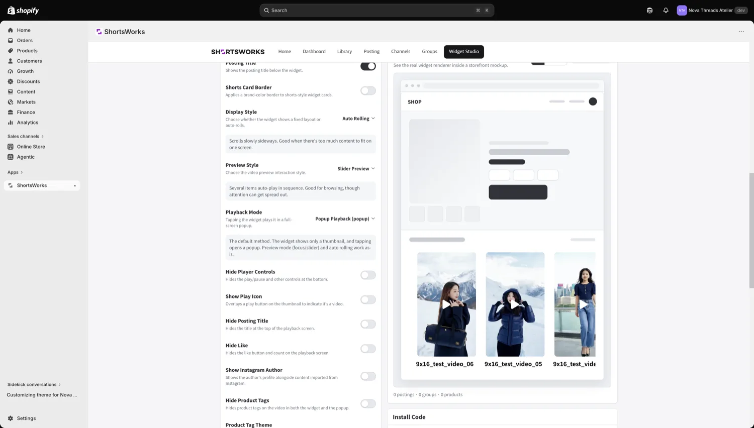
Behavior
Sticky (pin one widget on screen), items shown, short title, border on Shorts cards, display mode (fixed order or auto-rolling), preview mode, play mode (Story only supports popup), hide player controls, show a play icon, hide likes/title, show the Instagram author, and product-tag visibility / theme / discount rate.
Brand color
The color for story borders and accents. Pick a preset palette (ShortsWorks · Mono · Fresh · Signal · Pop) or set start and end colors for a gradient.
Content
What this preset shows — groups · shorts · products, saved per preset.
- Bind it to a group so content can grow without touching the preset.
- To show specific shorts only, pick them directly.
- On a product page, product matching decides which product's content shows — see Widget blocks.
Set as Shopify Default
Set as Shopify Default on a preset makes it your store's default widget. A floating widget or block left without a Widget ID uses it.
Import existing code
Have a <shorts-works …> snippet from before Studio? Click Import, paste it, and Import as preset — a matching preset is created with a new Widget ID. Your existing code keeps working.
All widgets ON / OFF
The All widgets ON toggle turns your whole store's widgets on or off at once — useful during maintenance. Each preset also has its own toggle for just that widget.